Making comics for the internet involves the evolution of your craft. Your style will change in big and minute ways, but hopefully every little shift is for the better. My style has changed a lot, in conjunction with outside influences and my own ideas warping from what they were when I started Things in Squares. It has been a while since I talked about my style, but there have been some big changes. I think they’re all for the better. Making comics, especially for the web, demands that you remain flexible in regard to suggestions from others, and your own natural inclinations to change. So let me talk about what I’ve changed.
Making comics a smaller width
I post to the comic-sharing platform Tapastic as well. Images there cannot be wider than 940 pixels. I always thought that bigger images would be better, so 940 pixels was the smallest I’d allow my comics to be. But it’s too wide. My comics work better when the reader can absorb more at once. For other comics, it’s better to have larger images, for example if they’re story-based comics with a single vertical scroll direction to advance the action. Another thing that was happening is that my Worpdress install was automatically re-sizing the images to the 900 pixel width of the main container, which cause the image to gain blurriness. I decided to start uploading my comics at 700 pixels. This solved both issues.
Guide attention using thicker outlines
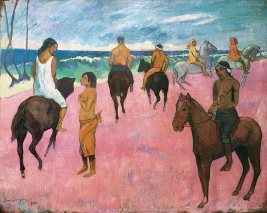
Drawing attention to characters using thick black outline goes back at least to Gauguin:

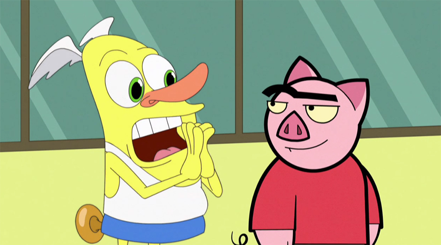
One of my favorite funny animated comic series was Drawn Together. The anti-hero was Spanky Ham, remember him?

I like the effect. I had started out using the same thickness of line on everything. Mostly this is because I only used a 0.1 thick Staedtler pen, and because I hadn’t given it a second thought. But since I use very light pastel palettes for both the foreground and back, it made sense to try to bring more attention onto the characters. I like the lines in Loading Artist, and the thicker lines in Extra Fabulous Comics. I would have liked to try using lines of different colors but I hand-draw with black pens, and depend heavily on contrast adjustments in Photoshop, so black is the most efficient option. I think the comics are better now:

Make secondary lines more opaque
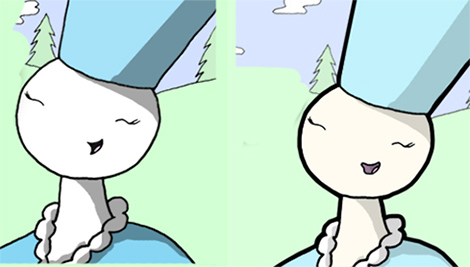
Another change is with the background lines and other secondary lines. Before, they were the same sharp black as the foreground and principle characters. But I’ve decided to go the way of many a webcomic and dilute the strength of these secondary lines. I think making comics is all about seeing something that works better and adapting it. I like dimmer background lines:

Changes to the dialogue bubble
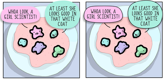
I finally caved and put a black outline around the dialogue box. This is because another thing I’ve started to do is color the dialogue bubble the same as the principle color of the character speaking. Without an outline, this can be painful on the eye. The outline also draws the reader’s attention to the words. It functions as a parser to allow easy location of meaning. I’m still using a little tail and the shadow:

You’ve probably noticed on this website and on the comics that I’ve made a new font. I’m quite happy with the new font. It’s a bit sharp, it’s true, which will explain the next change.
A third change is the color of the text. The black outline is the same thickness as the window border, and it’s full black #000000. But since I’ve developed a font that looks rough in high contrast, I decided to make these comics with text colored #333333:

And for good measure, I should note that I’ve started paying more attention to the development of the comic insofar as keeping in mind where I’ll place the text. Before, I didn’t give it a second thought when making comics. I also take my time to pad the text by selecting the bubble shape and using in Photoshop: Edit > Transform > Warp.
Using consistent colors and formatting
Low and behold, I have a template! That includes a set color palette. When I started out making comics, I didn’t have a format, I had no set color… nothing. The only thing I had was an established publishing routine. There’s still some worth to having a set publishing day of the week, but I think it’s much better advice for anyone considering making comics to establish a template and color palette. These can change over time, but choose something steady from the get-go. I use this color palette, and variations of the same hues:

That’s all I’ve changed. Here are some more articles of interest to anyone looking to make webcomics themselves:
- How to Optimize Comics for Google’s Search
- Where to Publish and Share your Webcomics
- How to Post a Comic to Reddit Using Imgur


Two big things for me lately have been:
1. Formatting all the panels to be the same size. I didn’t worry about this in the beginning as I was only posting in vertical format
2. Re-formatting every comic for different social platforms. I use on format for Facebook, Twitter and Instagram (they prefer a horizontal format) and one for everything else. A pain in the ass, but very much worth it.