I was just creating my latest weekly comic, when for some reason or another I decided to play around with the levels of the line drawing. I wrote about how to draw a webcomic or not, but now I see where I was making a serious mistake in Photoshop, and I was making this same mistake on all my comics up until now.
Actually I knew there was something amiss because my lines were too scratchy, even for hand-drawn comics. I still think there’s something amiss, and I suppose that’s part of the learning process. But this is something I should have known from the beginning, and probably would have if I’d learned how to use Photoshop correctly.
Don’t make the same mistake of changing the range of grays!
How not to use the ‘levels’ adjustment on Photoshop for line drawings:
Here’s a screenshot of the Photoshop ‘levels’ adjustment window. You’d navigate to Image > Adjustments > Levels.

What you see here is a graphic scale of the image’s distribution of grays from white to black. The lines that form the curve represent the quantity of pixels that take on the respective grays. As you can see, there’s a big tall line on the far right. This is the amount of pure black in the drawing. The far left of the graphic is white. In the rectangular area that encloses the graphic, the dominant white space represents how much white space the image has.
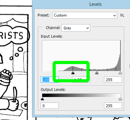
So, I’d introduce my line drawings into Photoshop, edit the exposure, and then the levels. I’d use levels in order to make my grayish lines blacker. Here’s a screenshot of how I’d do that:

I guess I never put two and two together. I would click and drag the black a slider from the white side toward the black side. I didn’t realize before that what I was doing was reducing the diversity of grays on the page. Sure, this made my lines blacker, but it also meant that their edges were far less feathered with myriad gray. You can see the bumpy edges of the lines in the screenshot above.
For someone who has been using Photoshop for a year, this mistake seems elementary. Any graphic designer would, and should, humph at this.
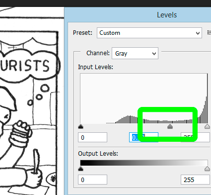
What I needed to be doing the whole time was already in front of my eyes. Here’s a screenshot of what that is:

I needed to grab the middle arrow (the gray one), and slide it toward the black side. This increased the blackness of the lines without reducing the availability of grays. It’s known as the midtone slider.
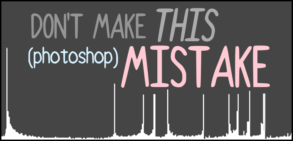
Here’s an image to highlight this mistake, and show you the different between one of my comic’s lines using both methods of adjusting the levels:

As you can see, you have a greater range of grays in the second than in the first. Zoom out, and the first line drawing would appear slightly pixelated.
I’ve been using Photoshop to make comics from the beginning, and slowly but surely my lines have gotten better. I don’t think they’ll ever be as good as digital lines, but these tiny discoveries are game-changing for them.
Here’s a tutorial about how to use Photoshop levels, which I probably should have read before starting this madness.
And if you haven’t already, use this link to purchase Photoshop CC.


